How Artique Redefined the Culture at Nando’s UAE Office—One Hue at a Time
The brief was simple.
Nando’s UAE wanted a workspace makeover
But what they really meant was—
“Help us feel something.”
Because somewhere between the brand guidelines and the boardroom walls, the soul had gone missing.
That’s when Artique stepped in—not with floor plans or Pinterest boards—but with a question that most designers don’t ask:
“How do you want your team to feel here?”
The Nando’s Office, Reimagined
Let’s be clear—this wasn’t just any office.
This was the headquarters of a brand known for flavor, fire, and fun.
But walk in, and all you saw was grey.
Cold lighting. White walls. Zero energy.
It looked more “spreadsheet” than “peri-peri.”
We saw the disconnect.
And we knew the answer wouldn’t come from catalogs.
It would come from color psychology.
Color Therapy for Culture Building
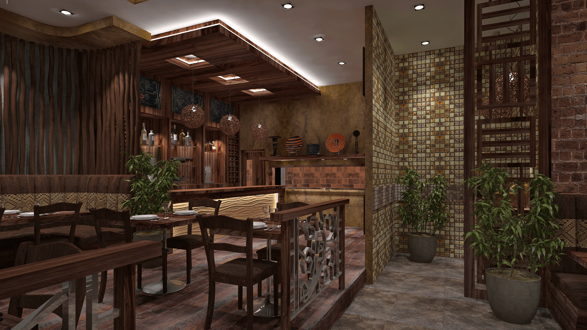
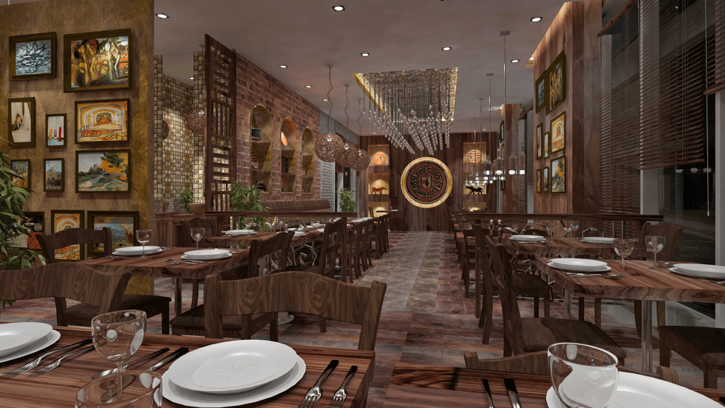
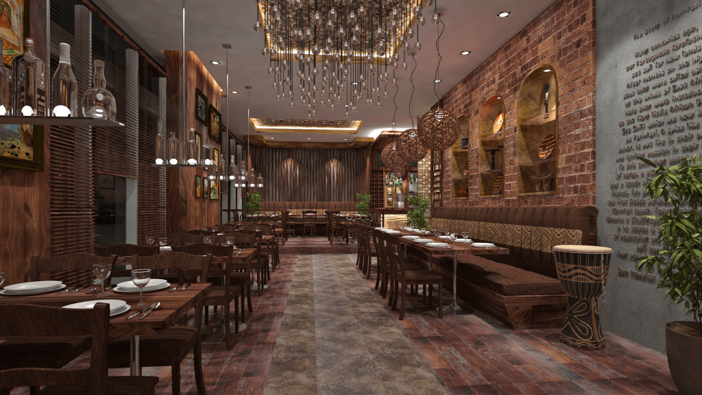
We started small—sun-washed terracotta in the common areas.
It brought warmth. Earth. Familiarity.
Then came deep mustard yellows in the breakout zones—a color that sparks creativity, warmth, and optimism. Think sunshine in a bottle, but for your brain.
For focus zones?
Olive greens and charcoal blacks to ground the energy.
It wasn’t just beautiful—it was strategic.
45 days later, something shifted.
• Lunchtime felt longer—not in hours, but in laughter.
• HR reported a drop in sick days and an uptick in team bonding sessions.
• Even the founder said: “Feels like us again.”
What Color Really Does in a Workspace
Color isn’t a design decision. It’s a leadership tool.
And at Artique, we don’t choose colors based on trends.
We decode your brand’s personality. We study your team culture.
We listen to the silence in your space.
Then, we paint with purpose.
Colors That Work in the UAE
In a vibrant, multicultural city like Dubai, color decisions are layered with meaning:
| Color | Emotion Triggered | Best Used In |
| Terracotta | Warmth, Authenticity | Entryways, Cafés, Collaboration Corners |
| Mustard Yellow | Energy, Optimism | Breakout Zones, Creative Teams |
| Olive Green | Calm, Focus | Meeting Rooms, Quiet Pods |
| Sand Beige | Coolness, Tradition | Majlis Areas, Living Rooms |
| Gold Accents | Prestige, Celebration | Reception Areas, Brand Walls |
The Science Behind the Feeling
It’s not magic—it’s neuroaesthetics.
Studies show colors directly impact cortisol levels, productivity, and even empathy.
So when we redesigned the Nando’s office, we weren’t just applying paint.
We were applying strategy, emotion, and culture—stroke by stroke.
The Artique Way
We don’t do design by default.
We do it by asking better questions.
By understanding the UAE’s cultural nuances, heat dynamics, and human emotions.
Whether it’s an office in Barsha or a villa in Palm Jumeirah—we color with purpose.
Want to Rethink Your Space?
Let us help you turn your workspace from functional to feel-good.
From “just another office” to “I love coming here.”
Book a Color Psychology Consultation with Artique.
Let’s paint your story—boldly, beautifully, and honestly.